Door categorieën bladeren
Ontdekken
Fiverr Pro
Nederlands
$
USD

Ebooks That Sell, Kindle Covers That Stand Out, Logos That Last
Skills
Bekijk mijn diensten

Social Media Content Designer (Ebook Repurposing)
Self Employed • Freelance
May 2026 - Present • 6 mos
A fitness coach reached out after publishing an ebook packed with solid workout and nutrition advice, but she had no idea how to turn it into content people would actually stop scrolling for. Her Instagram was quiet, her posts barely got engagement, and she knew the information inside her ebook was better than what her competitors were posting, it just wasn't reaching anyone. I read through her ebook to find the strongest, most shareable ideas, the tips readers would want to screenshot and save, then grouped them into themes: quick workout hacks, common training mistakes, and simple nutrition swaps. Rather than dumping paragraphs onto a slide, I focused on bold, punchy headlines paired with clean supporting visuals, since fitness audiences scroll fast and respond to content that feels instantly useful. I designed a set of carousel posts using strong contrast, bold typography, and consistent branding colors pulled from her existing logo, so every post looked unmistakably hers. Each carousel opened with a hook slide designed to stop the scroll, followed by digestible tips, and closed with a clear call to action driving traffic back to her ebook and coaching offers. I delivered the content in ready-to-post formats sized correctly for Instagram and Facebook, along with a few standalone quote graphics she could use for quick daily posts. I also included a short style guide so she or her team could create similar content consistently after the project ended. Weeks later, she messaged to say one of the carousels had outperformed everything she'd posted in months, and that people were finally commenting asking where they could buy the full ebook.

Freelance
Freelance • 1 yr 5 mos
Kindle and Amazon KDP
Mar 2026 - Present • 8 mos
A first time author came to me two weeks before her self help book was set to launch on Amazon KDP, with a cover she'd made herself using a template tool. It looked flat and forgettable, nothing like the bestsellers she was hoping to compete with, and she was worried it would hurt her launch before it even started. I asked her to send me the manuscript's core message, her target reader, and a few covers in her genre she admired. She wanted something that felt warm and encouraging rather than clinical, so I moved away from stock photography and built the concept around bold, elegant typography paired with a soft gradient background, letting the title itself carry the emotional weight of the book. I delivered three initial front cover directions: one typographic, one photographic, and one minimalist. She was drawn to the typographic concept but felt the title needed more presence at thumbnail size, since that's how most readers would first see it on Amazon. I strengthened the font weight, adjusted the color contrast, and tested it small on screen to confirm it stayed readable even as a tiny icon. Once approved, I built the full paperback wrap, calculating the exact spine width from her page count and trim size, then delivered print-ready PDF files alongside JPG and PNG versions for her ebook listing. I also created a 3D mockup so she could preview and promote the book on social media before launch day. She messaged me after publishing to say the cover was the first thing new readers commented on, and that it finally looked like the professional book she'd worked so hard to write.
Logo and Brand Identity
Feb 2026 - Present • 9 mos
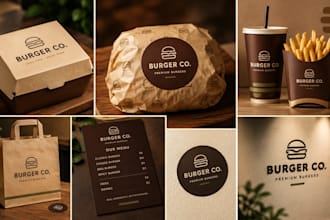
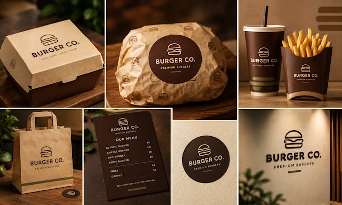
A local burger and pizza restaurant owner reached out, frustrated after two previous designers gave them generic clip-art logos that looked like every other fast food spot in the area. They wanted something that actually reflected their story: a family run kitchen serving bold, honest food, with a name they were proud of and a look to match. I started by asking about their menu, their target customers, and the restaurants they admired, then researched their local competitors to find a visual gap I could fill. They leaned toward a premium, slightly vintage feel rather than the cartoonish look common in the industry, so I proposed an emblem-style badge logo combining a stacked burger icon with clean, confident typography. I presented three initial concepts, each built around a different mood: bold and modern, warm and vintage, and a playful mascot option. They fell in love with the vintage badge design, so I refined it through two rounds of feedback, adjusting the color palette to a richer red and gold and tightening the icon until it felt sharp even as a small delivery app thumbnail. Once approved, I delivered the full package: transparent PNG and vector files for signage and packaging, a 3D mockup showing the logo on cups and burger boxes, and a small social media kit so their Instagram launch looked cohesive from day one. The owner said it finally felt like their restaurant had an identity people would remember, not just a logo. That project became the foundation for how I approach every restaurant brand since: understand the story first, then design the identity around it.
| (2) | ||
| (0) | ||
| (0) | ||
| (0) | ||
| (0) |

paredessamantha

Duitsland
Thank you very much Jack for the flyer. This came out beautifully well as expected. I am really pleased with it. The creativity is top notch. Every effort put into this made the design come out professionally and appealing. One important thing is that commuication was smooth as it important of getting...

paredessamantha
Duitsland
I am very pleased with Jack's delivery. He helped me with a brand logo for my business. Thank you very much.